One part of the vision of the Raptor team is to create a menu that combines the strengths of 3 ways to launch programs:
- The overview one has with menus.
- The speed one has by using console (if one knows the name).
- The possibilities of the search capabilities a system can offer.
 |
Aims
We want to make the best menu possible, and allow the fastest possible way to launch applications. We eventually want a menu that is focussed on the user and his tasks, not on the computer and his structure. And we want the menu to find items for us, not look for them ourselves.
Or put shortly: we want it simple, fast, user-oriented and beautiful
Current menus
Since the implementation of KMenu, different launch menu approaches have appeared:
- KBFX.
- Tasty Menu.
- Kickoff.
- The SUSE Linux Enterprise Desktop GNOME "Slab" menu.
The four menu types above share one common idea: we have to reduce the distance a user has to move the cursor for faster usage of the launch menu. All 4 do that in the same way: the menu is limited to a certain area, no longer moving out of that area (though SUSE Linux Enterprise Desktop Gnome Menu does it only partially, by not displaying everything and opening a window when you want to see more applications).
So in our view, all of those 4 menus improve the user experience significantly. However, this doesn't go far enough.
Concept of Raptor
To further shorten the mouse paths, Raptor only uses one panel. The idea is that we want to give an overview, but are ready to sacrifice a little bit of it and instead want to interpret the user's past behaviour to calculate what he probably wants.
Search and usage database
This is implemented via a usage database. When a user e.g. searches for “ko” (type ahead, no “enter” necessary), the menu displays it as following, with Konqueror already preselected:
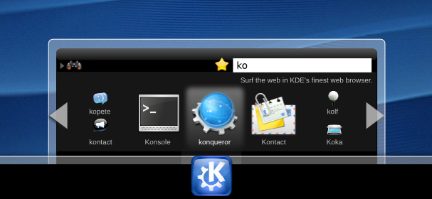 |
This is because it searches for “ko” and afterwards compares the result with following table (which is very simplified, as I won't describe the algorithms used):
| Application | Relevance |
|---|---|
| Konqueror | 95% |
| Konsole | 87% |
| Kontact | 86% |
| Kopete | 75% |
| Kolf | 64% |
| Kooka | 58% |
So the accessibility of the most relevant items is the fastest, as it's already preselected, and the 3 most relevant items are displayed bigger. The reason to display Kopete, Kolf, Kontact and Kooka as smaller items is to be able to display more items on the restricted area. If further, less relevant items exist, they can be accessed by using the scroll areas.
Browsing
This usage database is also used when browsing, not only when searching. So when a group is selected, the items are displayed according this rule.
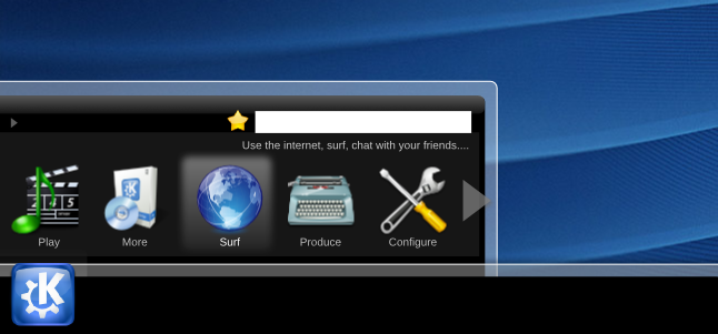
Raptor also uses another approach for grouping the items. The traditional approach is creating categories by asking “what are the programs?” which leads to categories as “utilities”, “office suites” and so on. Raptor's approach is more centred on the question “what does a user want to do?” which leads to categories “Play” (e.g. music, videos, slideshows), “Configure”, “Browse” (e.g. the web, the filesystem and so on) and “Produce”. As indicated before, the items are prioritized by means of the usage database and then arranged accordingly.
In the upper left corner of the menu one always sees where one is currently in this structure.
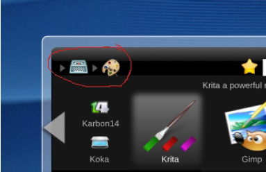 |
By clicking on the parent group (here the typewriter for “Produce”), one always changes back to the content of that group. As alternative, one could also just click the “up” arrow to change into the parent category.
Favourites
I think one can safely say that every user has a set of “favourite” applications. For me, those are Firefox, Kopete, OpenOffice.org Writer and the GIMP.
In Raptor, those favourites are represented by the yellow star. When I'm in “Draw”, I can drag-n-drop the Gimp icon onto the star and thus add it to the favourites.
By clicking the star, the content in the panel changes to my favourite applications.
Position on the desktop
As you might have noticed, all these pictures show Raptor on the bottom and centred. This – of course – is not the only possible position for it. Of course one is able to select the way it is aligned. We just liked the balance of having it in the middle, but you are free to place it in the lower right corner, as you might be used to do.
 |
State
Now we come to the current state of Raptor: not finished. Our team is quite small, so if someone wants to join us, feel free to contact Siraj Razick to get a more detailed view on the open issues. Siraj is on the panel-devel mailing list.
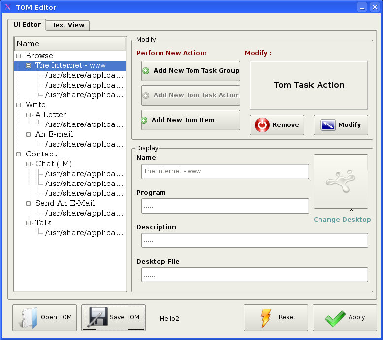
Two plugins, applications (for the traditional grouping of apps) and TOM (Task Oriented Menu, including an editor for grouping without restructuring the applications for other menus) are pretty much done. A part of the presentation is ready, too.
 |
 |
The usage database is not yet implemented, and the favourite applications part is still open. A further plugin for disks/CDs/USB-sticks etc. is planned, but work hasn't yet started there.
Thank you for your interest.